English
 Español
 Deutsch
 Français
 Svenska
 Nederlands
 Italiano
 Norsk
Norsk Русский


Whether your bedroom is well-organised and pristine or whether it is an ordered chaos, each bedroom has a story to tell- a story that reflects the owner quite beautifully. It is one of the only spaces in a house that is personal to you. A bedroom can be used as a space to disconnect from the world and connect with yourself. It is a place to relax and calm yourself so that you can be ready for tomorrow and its challenges. This is why it is quite crucial to design your bedroom in such a way that it becomes suitable for your well-being and peace.
Thankfully, there are many bedroom colour combinations to choose from that can turn the look of your bedroom.
Here are some cool colour tips for a cool bedroom.
Positive Pink
Stunning shades of pink can be used to create a sophisticated and elegant boudoir. It can be combined with various other shades for a simple yet romantic look. The underlying beige tones of nude pink make it look sombre and not too bubbly. It can be paired with white furniture and accessories for a regal look.
Go Pastel
Pastel shades and stripes can be used to add depth to any room. Pastel shades can make any room look stunning and decadent. Pastel shades can also mute other shades and make them look subtler and more stylish. You can also accessorise pastel walls with pastel accessories and objects. For an interesting contrast, why not add some vibrant accessories to make them pop?
Awesome Orange
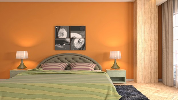
A rustic orange two-colour combination for bedroom walls can make your bedroom look earthy and cool. For added panache, pair the orange shades with wooden furniture and accessories that can create a stunning vintage vibe. Keep the floor and curtains light to add a sense of light to the overall aesthetics. You can also add an orange headboard and pair it with brown shades for a rich, chocolaty look. Simple rugs in orange and brown tones can also do wonders for any room.
Never Say Never to Navy
Navy and similar blues can make your bedroom look calm, cool, fresh, and timeless almost instantly. Bold colours can look quite stunning in a bedroom albeit if used correctly. You can use jewel shades of blue such as navy and indigo in your room for a sombre yet vibrant look. Add daring accessories and stunning patterns to make the blue pop. You can also combine blue with white for a more muted yet elegant look. Feel free to experiment as much as you want with blue, you can’t go wrong with this colour.
Pack a Punch with Purple
Purple is considered to be the colour of royalty and it is no surprise that you can make your room regal with the help of purple. Soothing shades of purple such as lilac and heather can add an elegant touch to your room. These shades can also make your room look vintage and add a sense of style to the room. Do not overuse purple though, otherwise, your room may end up looking quite garish. Combine the purple with grey and similar tones for a simple yet well-put-together ambience. Pair the purple with white accessories and furniture pieces for a Victorian aesthetic.
Crown the Brown
Brown and woody textures are not meant just for rustic rooms, they can also be used to decorate chic and stylish bedrooms. Wood with dark tones is one of the best colour combinations for bedrooms. You can combine polished oak, walnut, birch, and other similar wooden textures with soft fabrics and colours for an interesting look. Mid-tone wooden textures can go well with almost all shades.
Way of the White
There are numerous shades and hues of white available so making a choice can be quite difficult, but don’t worry, all shades of white look equally good. White has been used in rooms for centuries as it provides a pristine, clean, and elegant look. You can use white in the form of upholstery, curtains, drapes, bed covers and pillows, furniture, and marble as well.
Gorgeous Greys
Grey does not have to mean dull and sad, it can often stand for sophistication and luxury. Use shades of platinum and pewter to make your bedroom look gorgeous and glamorous. Try to maintain the palette for an added oomph factor to your room.
Vibrant Variations
Don’t be afraid of adding bold and vibrant colours to your room to make it pop. using different colours judiciously is the best way to make your space look stunning. By making your bedroom pop, you can use the room not just for sleeping but also as a space where you can think and come up with new ideas. So be bold and dare to think differently.
The Golden Plum
No, not the fruit, but allow Midas's touch to take over your furniture, wallpaper, and drapery. Gold combined with luxurious shades of plum is one of the best ways to make your space look decadent and fancy. You can also incorporate art-deco style in your bedroom with these shades.
Tantalising Teal
If anyone says that teal is a boring and basic colour then they are wrong. Teal can make your space look tantalising and beautiful. You can use teal on furniture and also in drapery. Feeling daring? Why not paint your accent wall teal combined with decadent shades of gold? Try to make a layered look for an added touch of glamour.
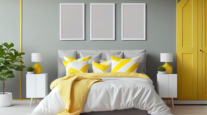
Sunny Yellow
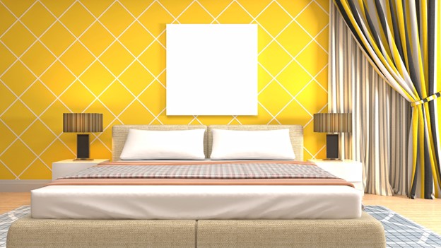
You can paint your bedroom yellow for a stunning and bright look. Yellow with golden is sure to give your bedroom a warm, bright, positive, and welcoming vibe. It can also boost your mood quite significantly. Grey and yellow go quite well with each other.
Glorious Green
Green in various hues such as key lime, sage, dark green etc. can add a subtle hint of elegance to any room. You can use green in accent pieces or you can also use it in drapery. Green and black are not only rich but also quite invigorating.
Black is Back
Well, to be honest, black never really left. Black has and will always stay in vogue. It is one of the favourite colours of designers and customers alike. While some people may think of black as depressing, it is rather elegant and classy. It is a mysterious shade that can inspire you.
Charismatic Coral
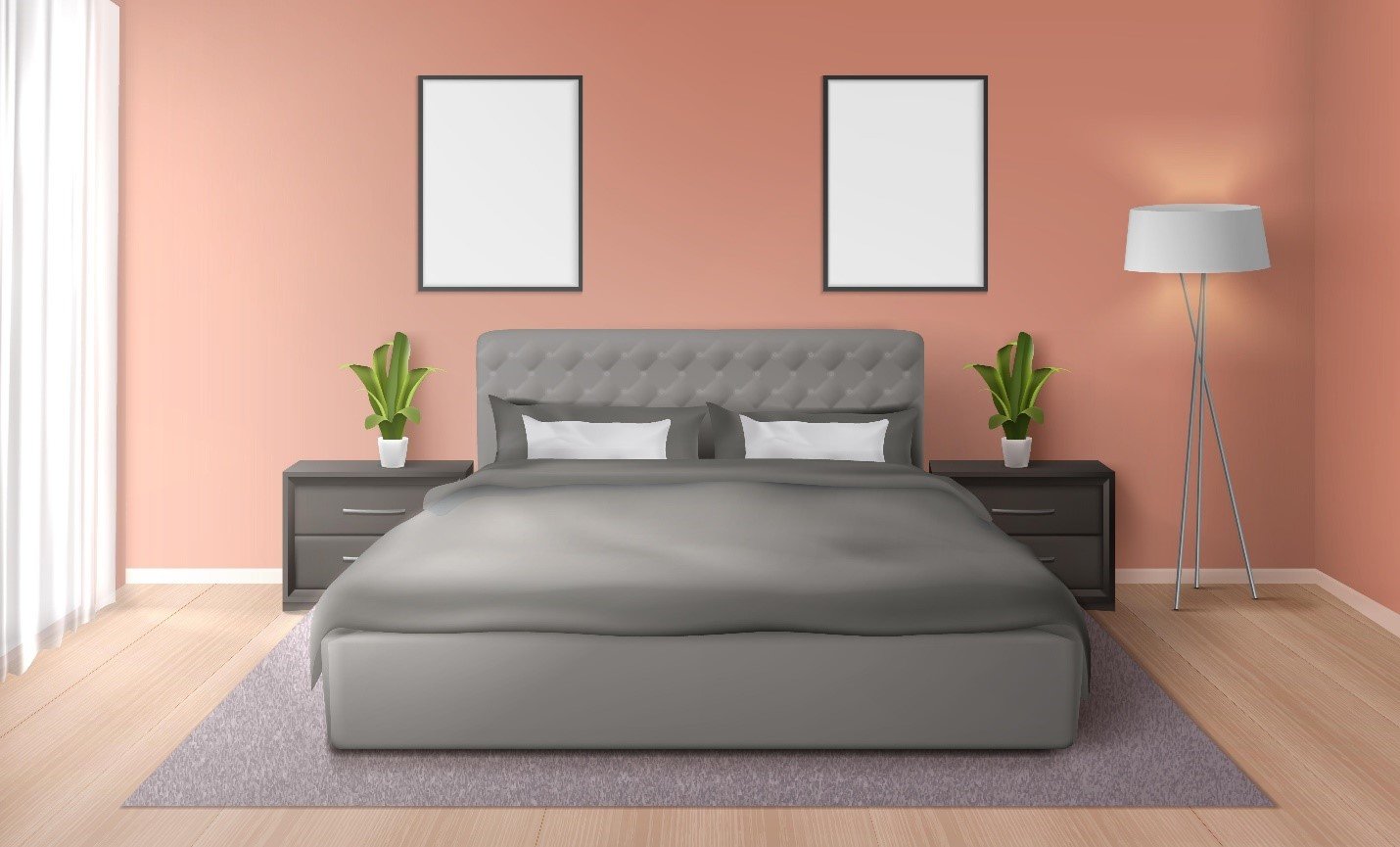
You don’t need to colour your whole wall if you don’t want to. You can use beautiful coral tones to highlight your walls and also on your furniture. You can also combine coral with other colours to create a stunning two-tone colour effect.
How Colour Choices May Impact Property Value?
Colours choices can have a significant impact on the value of a property. Here are some ways that colours choices can affect property value:
First impressions: The colour of a property's exterior can make a significant difference in its curb appeal. A well-chosen colour can make the property stand out in a positive way, while an unappealing or outdated colour can detract from its attractiveness.
Perception of space: Interior colours can affect how spacious a room appears. Lighter colours can make a room appear larger and brighter, while darker colours can make a room feel smaller and more intimate.
Mood and atmosphere: Colours can affect the mood and atmosphere of a property. For example, blues and greens can create a calm and peaceful atmosphere, while yellows and oranges can create a sense of energy and warmth.
Updating and modernizing: Choosing modern and on-trend colours can give a property a fresh and updated look, which can be appealing to potential buyers. On the other hand, outdated colours can make a property feel tired and in need of updates.
Cohesion and flow: Consistent colour choices throughout a property can create a sense of cohesion and flow, making it feel more cohesive and well-designed. Conversely, haphazard colour choices can make a property feel disjointed and cluttered.
Personalization: While bold and unique colours can make a property stand out, they can also limit its appeal to a smaller group of buyers. Neutral colours allow potential buyers to imagine themselves living in the space and make it easier for them to personalize it to their tastes.
Overall, colour choices can impact the value of a property in multiple ways. It is important to choose colours that are appropriate for the property's style, location, and target market to maximize its value.
Author Bio
Isha Tandon has worked within the architecture and interior design industry as a flooring consultant expert - specializing in tiles, stones, and terrazzo. She has worked with Orientbell Limited, a leading tile manufacturer in India, as a product development manager in the design team and has recently joined the marketing team as their digital content expert. Her experience comes in handy in understanding the audience as she creates value-driven functional & informational content for the readers. She creates lifestyle pieces that focus on interior design products, trends, and processes. She loves to travel to historic places with rich architecture.